MUC MOMENTS:
Delivering Personalised Micro-Activities to Engage Airport Layover Passengers
MY ROLE
Product Designer
duration
TEAM
Data Analyst & Marketing
Platform

Introduction
Transit passengers at Munich Airport typically spend 2 to 6 hours on layovers. The airport needed a digital touchpoint to shorten perceived wait times and strengthen brand presence, but asking travellers to download an app created too much friction.
I led the User research and UX design for MUC Moments, a browser experience that requires zero installation and tailors micro-activities to a passenger’s remaining layover time and interests.
Our Data Analyst gathered insights on gate dwell times, location hotspots and flight data, while Marketing, co-led passenger surveys and personas.
Through live testing at Munich Airport gates, we validated that removing download barriers unlocks direct engagement with transit travellers.
What I Found?
I observed 42 passengers, conducted 28 surveys and 14 interviews at Terminal 2.
The pattern was clear:
Passengers weren't bored. They were worried about missing their flight.
They repeatedly checked departure boards, even when nothing had changed.
Boarding uncertainty was preventing engagement.

What we discovered?
We found that majority of these travellers lie in these categories.

Problem
Initially, the problem looked like Boredom. However, user observations revealed Boarding Uncertainty as the root case.
Behaviour: Passengers stay "mentally stuck" near the gate, checking flight boards every few hours because they fear missing a gate change.
Insight: Passengers won’t engage with airport services unless they feel confident they won’t miss their flight.

Business impact:
Low engagement with airport services.
Lost revenue from retail and food.
Missed opportunity for Airport to create a positive impression that influences passenger to choose Munich for future travel.
User Group
The research revealed 3 distinct passenger segments
Long-Layover Travellers: Seeking meaningful engagement.
Anxious Transit Passengers: Worried about missing their flight.
Departure Passengers (Arrived Early): Wanting relaxation options.
All three shared the same need: engagement + reassurance.

Moving from Insight to Design
Passengers won't engage if they fear missing a gate update. That meant boredom and anxiety had to be solved together, in the same product.
Decision 1: Browser-based experience over native app
Passengers are often tired, carrying luggage and navigating an unfamiliar airport. Asking them to download an app, create an account or search for their flight would add unnecessary friction.
Passengers could scan a QR code displayed at their boarding gate.
The experience automatically:
Recognised the boarding gate
Connected the passenger to their departing flight
Started live flight monitoring
No app download.
No account creation.
No flight search

Decision 2: Keep boarding alerts inside the experience
Without a native app, push notifications weren't an option. So the boarding alert had to live inside the experience itself. A gentle overlay within whatever activity the passenger was using.
Passengers could receive updates about gate changes, boarding announcements and final calls while continuing to use the experience.
The product reassured them that they would know when something important changed.

Decision 3: Activities grounded in emotional states
Once the uncertainty around boarding was addressed, the experience could help passengers make better use of their waiting time.
We initially explored 8 activity concepts, but selection was driven strictly by behavioral and emotional signals from research, not ideation breadth.
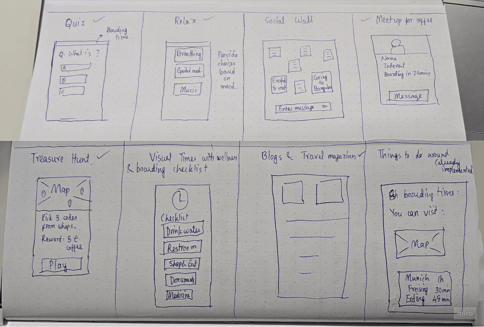
Passengers fell into three dominant states:
Chosen Activity | Who it's for |
|---|---|
Guided Breathing | Anxious passengers who needed to decompress |
Travel Blogs | Bored but curious passengers wanted light discovery |
Quizzes | Passengers who just wanted to enjoy |
The remaining five concepts were removed because they lacked a clear alignment to a dominant passenger state or introduced unnecessary cognitive effort in a high-transit environment.
The Solution: MUC Moments
Time-Aware Activity Recommendations
The app checks remaining boarding time and suggests the right activity – quick tasks for short waits, deeper content for longer layovers.
Real-Time Boarding Alerts
Gentle, non-intrusive notifications that appear inside every activity

Engaging Activities
Travel Blogs (curiosity), Guided Breathing (relaxation), Quizzes (entertainment): each addressing a distinct emotional need identified in research.

Concept Acceptance Testing
I used a two-phase approach to gather feedback from 18 passengers and ensure the solution was intuitive and effective,
Methods Used:
Observed real-world usage at gates with real boarding stress.
Think-aloud protocol
User Experience Questionnaire.
Results:
UEQ results: above-benchmark scores on Attractiveness (1.8), Dependability (1.6), and Novelty (1.4).
Passengers visibly relaxed during use (observed in person).
85% positive feedback on the combined reassurance + engagement concept approach.


What this validates?
When passengers have continuous reassurance on their flight status, they are more willing to engage with airport services during long layovers.
Presentation to Munich Airport stakeholders
The final design was presented to the airport's commercial team. The session covered research findings, design rationale, concept testing results and a recommended next phase.

Outcome
The project reframed the original problem.
Instead of asking:
How do we entertain passengers during long layovers?
I focused on a more fundamental question:
What is stopping passengers from leaving the gate in the first place?
Research showed that the barrier wasn't a lack of things to do. It was a lack of confidence.
That insight shaped the entire experience, from frictionless onboarding and continuous flight information to relevant content and airport exploration.
By reducing uncertainty first, the product could turn passive waiting into a more confident and valuable layover experience.